
Client
Learn more below

How did we approach the task?
We realized this wasn't a story about "childish" design. Nor was it a story about a stern industrial brand.
Therefore, we sought a balance—between strength and play, between the reality of a quarry and the format of entertainment.
We based the design on imagery intuitively associated with construction machinery:
- a bucket integrated into the letter "K";
- simplified geometry of metal forms;
- industrial colors

The logo and its meanings
We incorporated several levels of perception:
The most recognizable image, where the first letter transforms into a powerful excavator
A more concise stylization referencing a working tool—the bucket
An abstract solution where the graphics use color to evoke the sandy landscape of a quarry
How the brand works in physical space
The logobook provides detailed guidelines on:
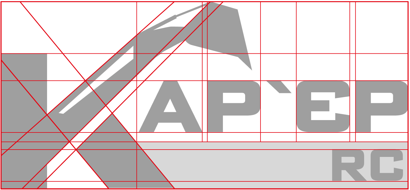
- clear space requirements and logo variations;
- color combinations for various media;
- logo usage on dark and light backgrounds;
This allows the brand to look equally confident both on a physical storefront and in a digital environment.
Result
The brand has gained its own character—confident, lively, and entertaining. The logo highlights the uniqueness of a format that is virtually non-existent in the Ukrainian market and looks truly distinctive.
"We discussed the task, met to agree on the final version, and received the result. Everything was done quickly and professionally."

Artur Botvyna
Co-owner, RC Karyer
Project team:
Bohdan Radkevych - Creative Director
Alina Khokhulia - Graphic Designer