
Client
Learn more below

Monogram
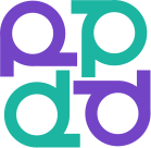
In accordance with the brief, the logo is based on a combination of the letters "R" and "Ts," which form the graphic image of a person.
This is a visual metaphor for support, interconnectedness, and equality. The mark serves as a symbol of community and the value of every individual.

Flexibility of use
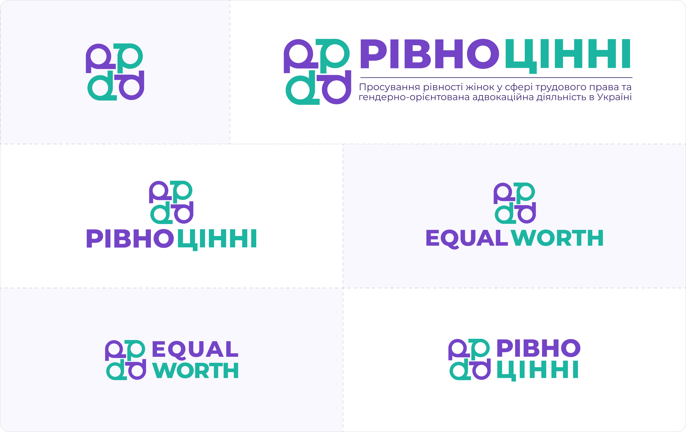
We provided a complete system of variations: horizontal, vertical, and abbreviated versions. This allows the identity to be used in presentations, social media, documents, events, and digital materials without losing brand recognition.
A balance of strength and empathy
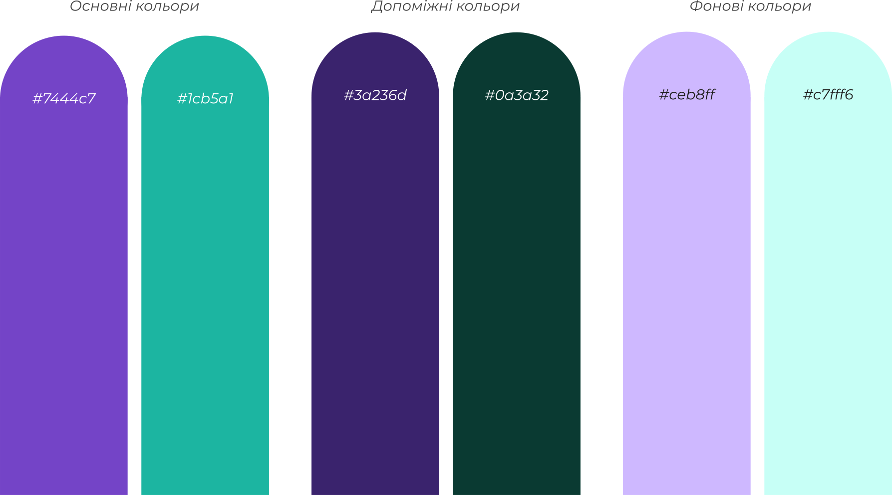
The primary palette combines deep purple and vibrant turquoise—a blend of strength, determination, and openness.
Secondary and background colors allow the identity to be scaled across digital and print materials without becoming overwhelming.
Additionally, they work harmoniously with the colors of the "Girls" NGO.
Secondary and background colors allow the identity to be scaled across digital and print materials without becoming overwhelming.
Additionally, they work harmoniously with the colors of the "Girls" NGO.
Result
The logo combines a symbolic concept with a clear form, making it memorable and effective across various communication formats.
The resulting brand book serves as the foundation for the project's visual communication. The project now has a clear and systematic identity that is easy to use across different formats—from presentations to informational materials.
The resulting brand book serves as the foundation for the project's visual communication. The project now has a clear and systematic identity that is easy to use across different formats—from presentations to informational materials.

Project team:
Alina Khokhulia - Graphic Designer