
Client
Learn more below

Analytics before design
We began our work by analyzing Optinet's existing identity and the competitive landscape among internet service providers in Poltava.
This allowed us to establish a clear foundation for the rebranding: understanding what is valuable to the brand today and how to make it visually relevant in a modern context.
Color usage
Since Optinet is a brand with a long history, the primary brand color has been preserved. We have complemented it with a secondary palette that expands the possibilities for using the identity across different communication channels and makes the brand more flexible.
A separate color scheme was developed for the Optinet business division. This decision is based on the logic of target audience segmentation and allows for a clear visual distinction between residential consumers and business clients without compromising the brand's integrity.

The B2C segment features an emotional, dynamic, and friendly tone, associated with openness, technology, and ease of use.

The B2B segment (business clients) reflects a more restrained, professional, and stable tone of communication.
Design system
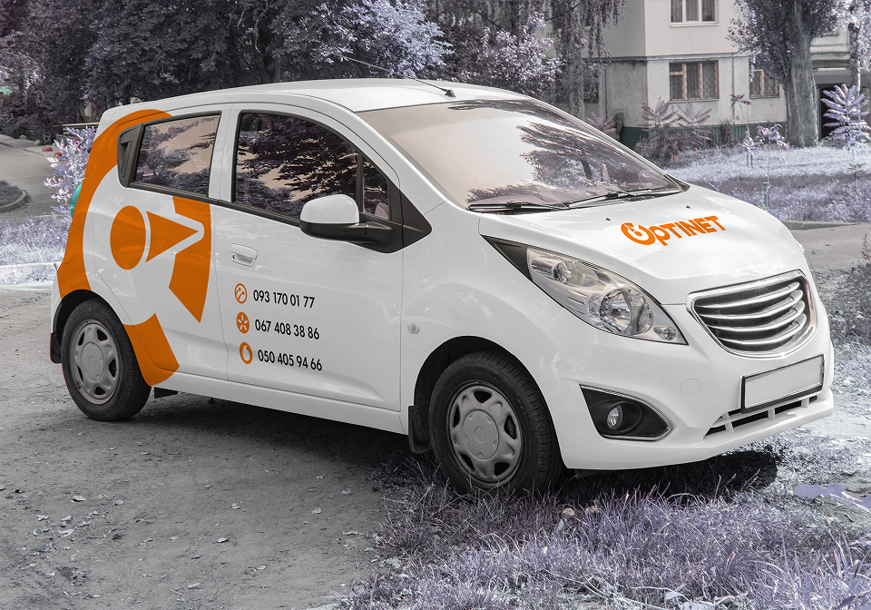
We developed several variations for using the logo mark, creating a recognizable and scalable visual language for the brand. This approach allows the identity to be easily adapted across various media—from digital platforms to offline materials.


Result
The updated Optinet branding is a cohesive system that blends the company's experience with a modern approach to communication and visual identity.
It is a fusion of heritage and modernity. It preserves customer trust while meeting the demands of today's market and preparing the brand for future growth.
It is a fusion of heritage and modernity. It preserves customer trust while meeting the demands of today's market and preparing the brand for future growth.




Project team:
Bohdan Radkevych - Creative Director
Alina Khokhulia - Graphic Designer