
Client
Learn more below
The Task
To create a visual that resonates with existing members of the organization, fosters a sense of community, and attracts other veterans to the organization.
Meanings
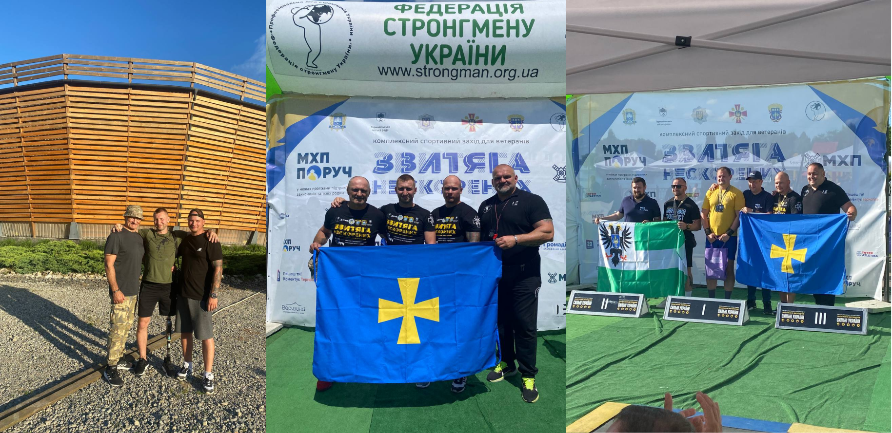
The communication goal was to reach out to veterans to demonstrate the existence of a community and opportunities for adapting to civilian life.
The meanings embedded in the logo were intended to reflect a sense of belonging to a community and reinforce the value of "you are not alone."
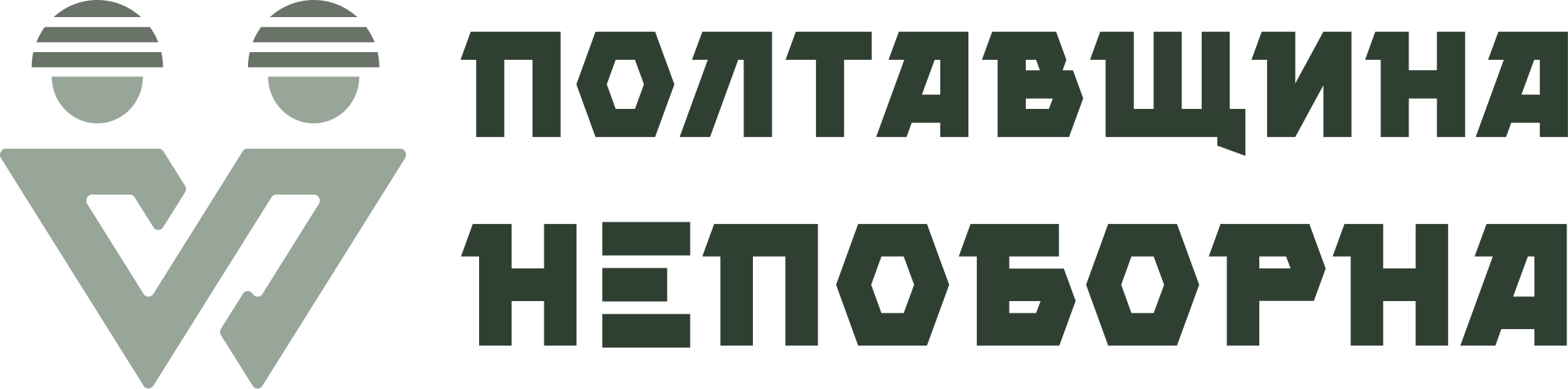
As a result, we settled on a figure that embodies several defenders.


The main logo briefly visualizes the established values and objectives.
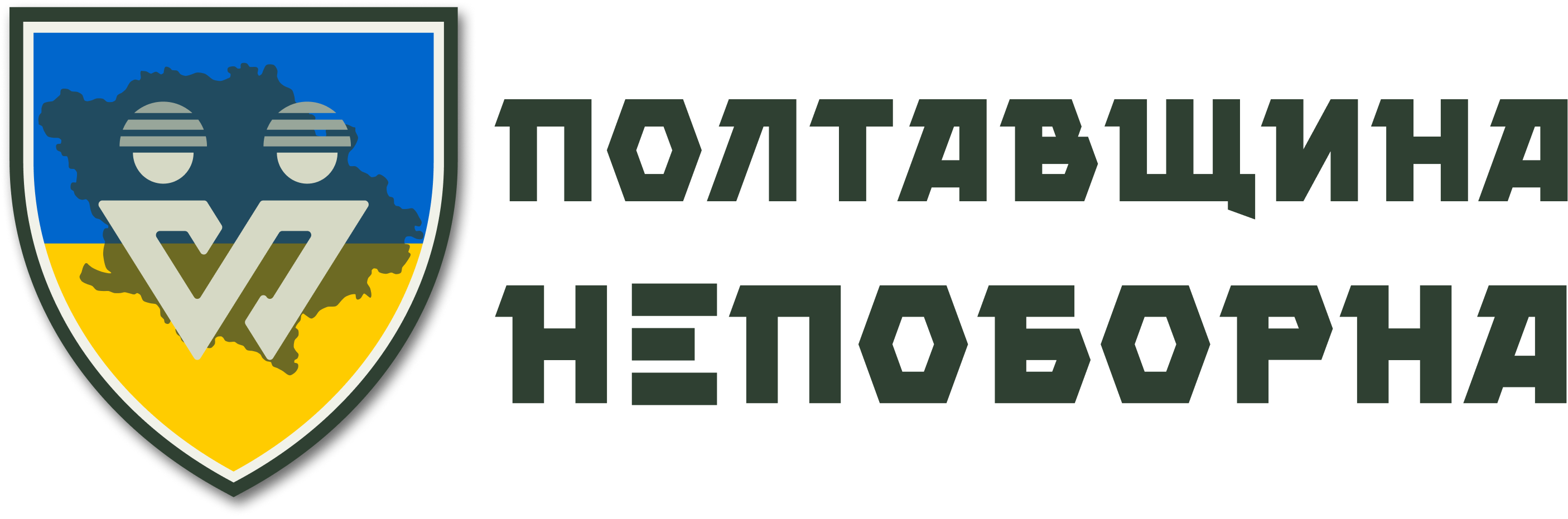
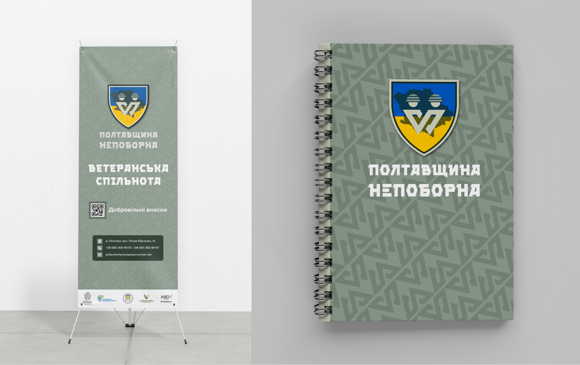
The detailed version allows for an expansion of the values it conveys. The shield demonstrates protection and military affiliation, the Ukrainian flag represents patriotism, and the background outline indicates ties to the Poltava region.
How was it created?
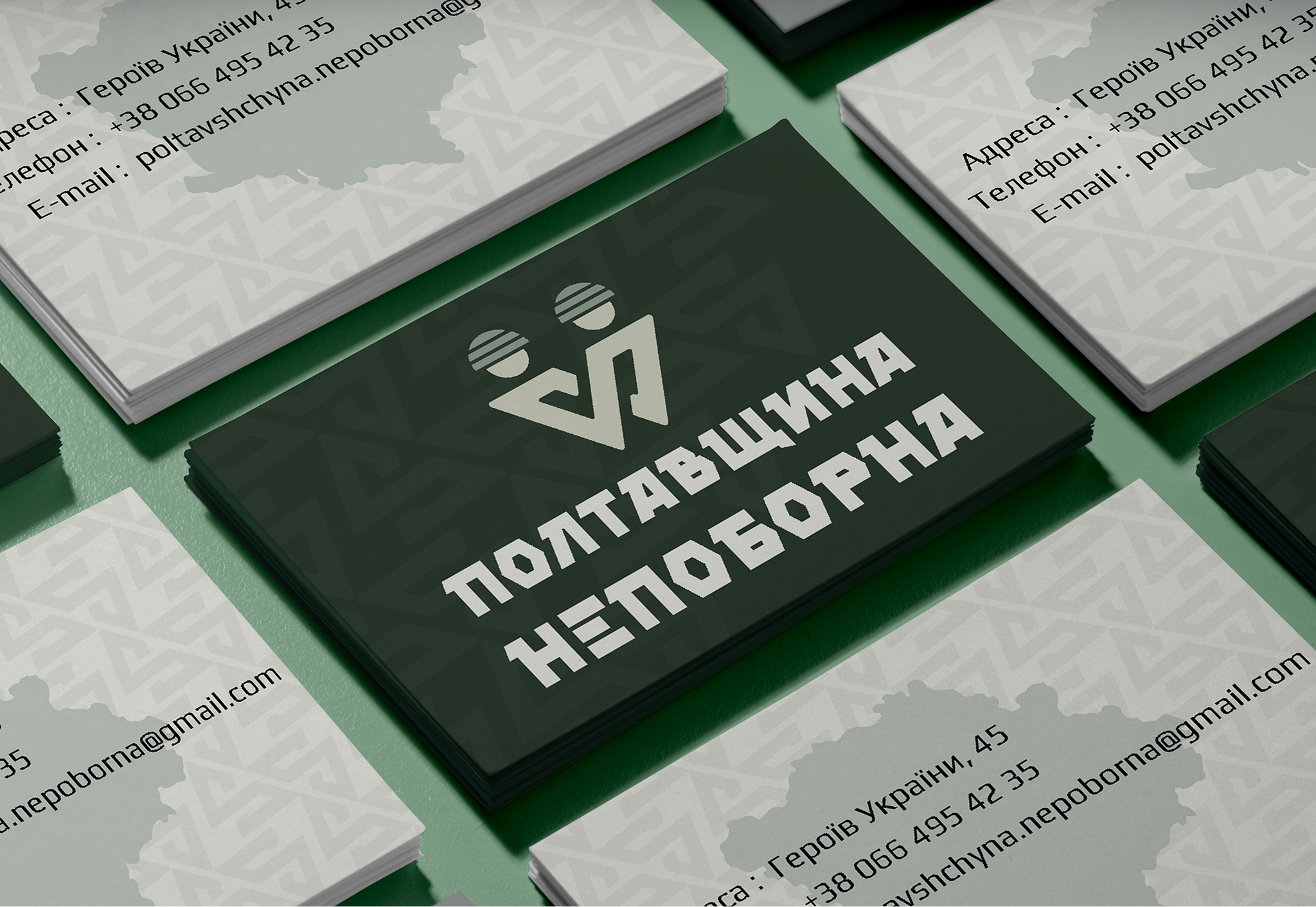
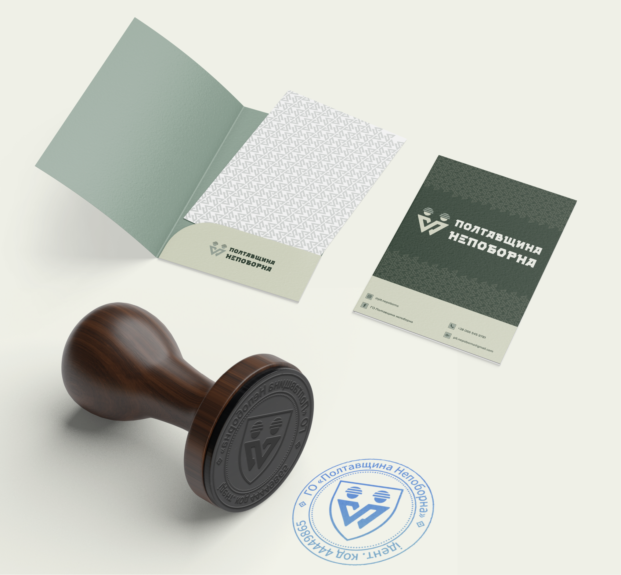
The logo shows two soldiers, emphasizing the value of community.
The only symbol indicating that the character is a soldier is the helmet.
Identical outlines demonstrate equality, assistance, and support.
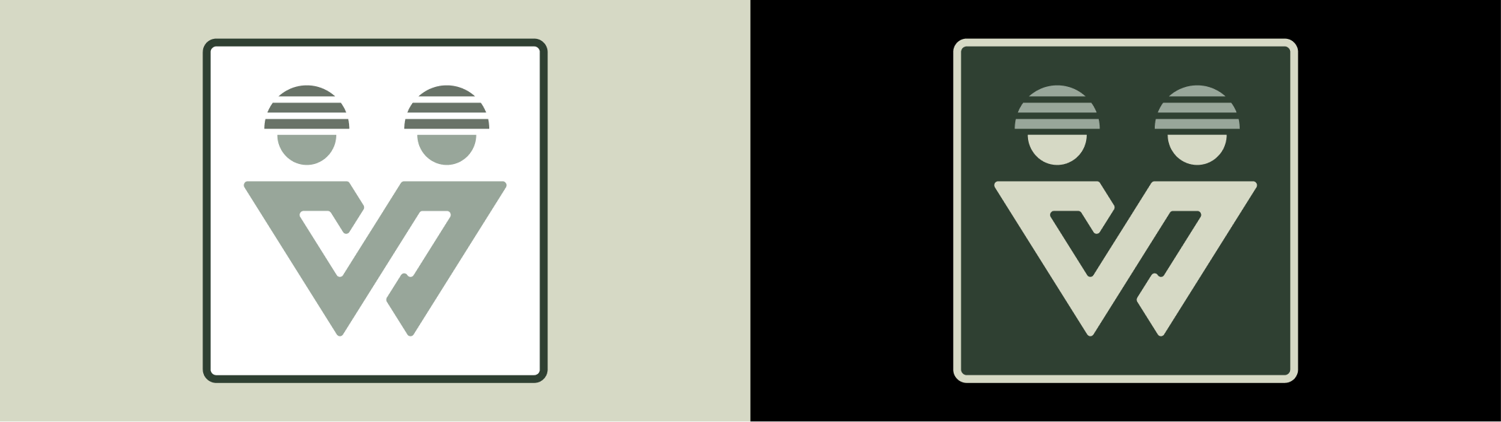
This logo concisely reflects the following values:
- Understanding;
- Protection;
- Community;
- Assistance;
- Peer to peer;
Colors and pattern
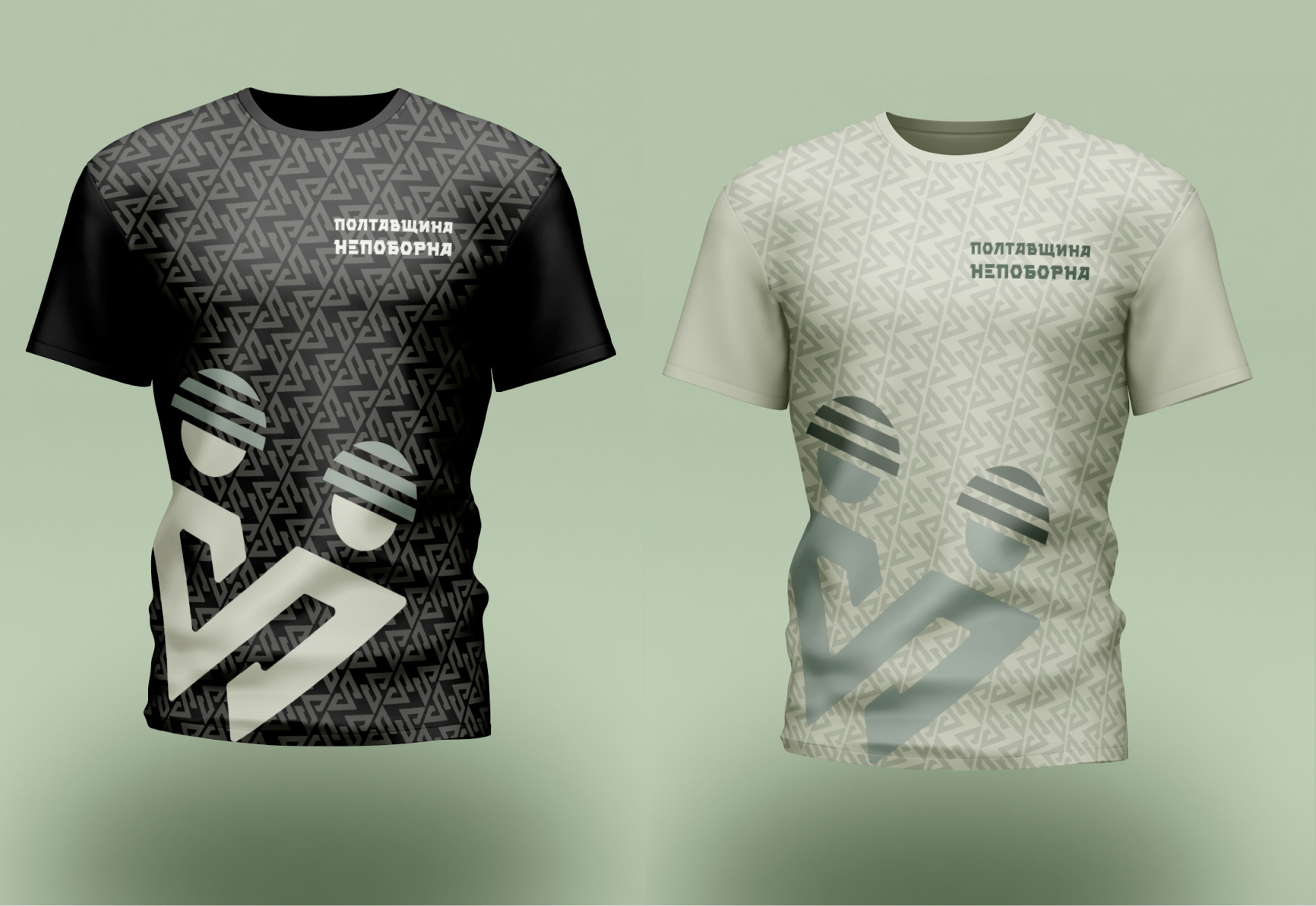
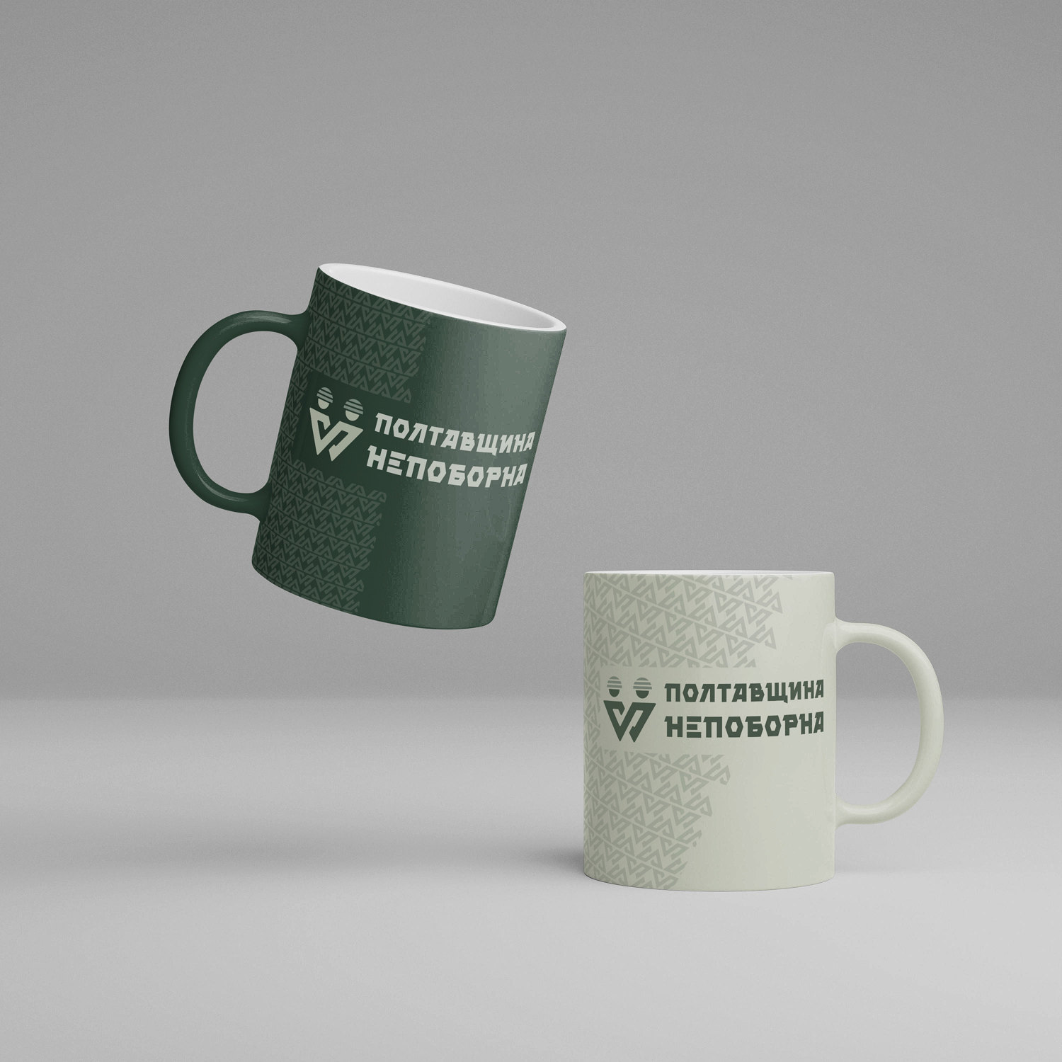
The colors were chosen to match a camouflage pattern, which is directly associated with the military sphere, while not explicitly referencing it.
Thanks to the symmetry of the logo, we created a pattern based on it that fits the style and reflects restraint, equality, and support.

Project team:
Alina Khokhulia
Bohdan Radkevych
Anastasiia Smolko