
Client
Learn more below

How does it work?
The course featured an intensive program that included lectures, practical assignments, workshops, guest speaker sessions, and a graduation ceremony.
This project aimed to provide participants with not only theoretical knowledge but also practical experience, helping many of them get their first professional start in the creative industry.

Branding Style 1/2
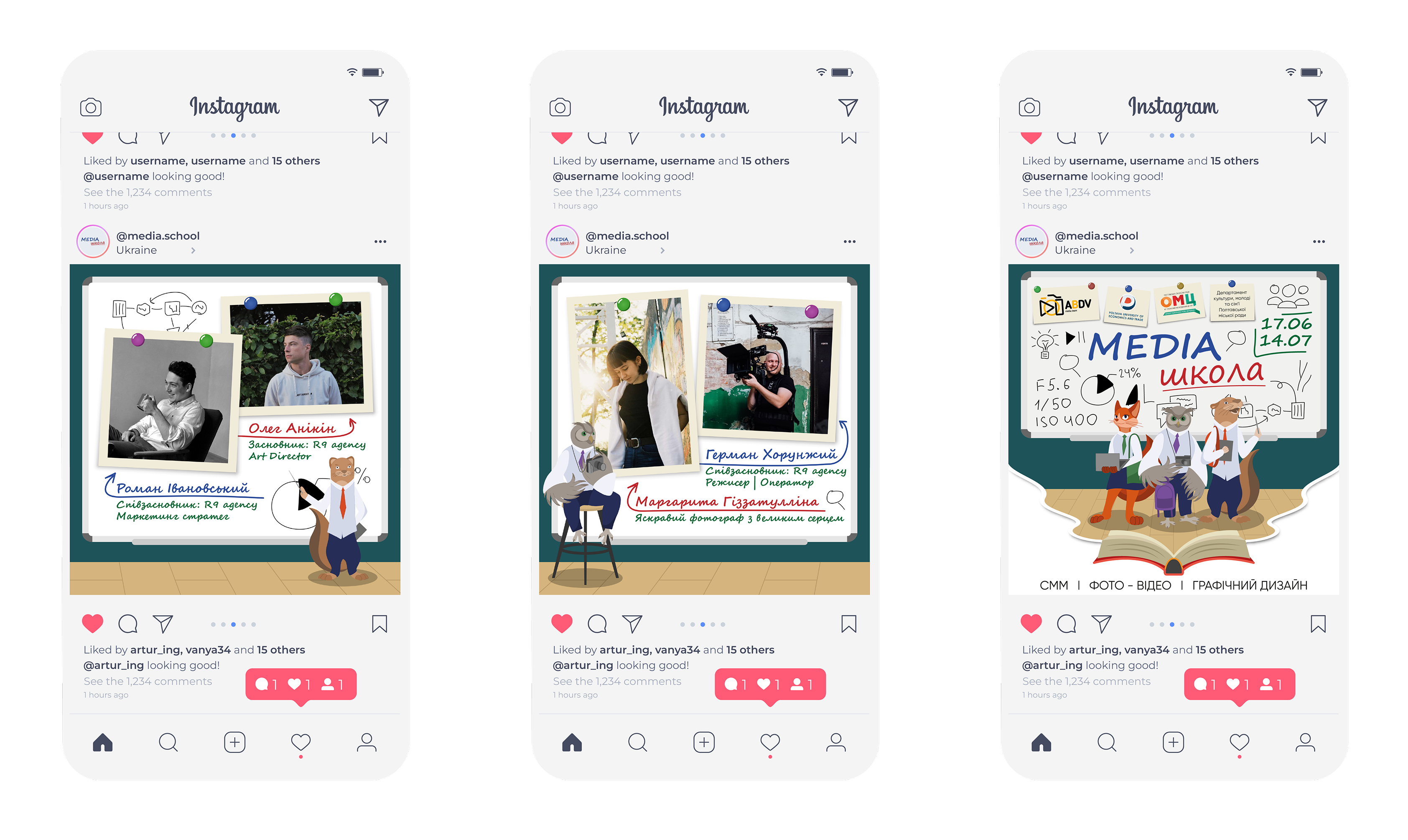
A unique branding style was created for the event, highlighting an atmosphere of learning and innovation. The development included print materials, presentations, and other handouts.
We were inspired by a blend of modern design and nostalgic elements reminiscent of school days.
The visual elements included imagery of chalkboards, mathematical formulas, and markings that evoke associations with learning. These details were complemented by symbols related to the media industry to ensure the project's cohesion.
Branding Style 2/2
To diversify the branding, we created original characters representing the three main areas of study: marketing, graphic design, and production.
The characters were given unique looks that matched the theme of each track.

Heroes / Characters 1/3

Heroes / Characters 2/3

Heroes / Characters 3/3

Style
The characters were drawn in two styles — first graphically in a "sketch" technique, and then adapted to look like chalk drawings. This allowed them to be used on various backgrounds, adding visual variety.
The characters interacted with each other across all key visual materials: posters, schedules, and presentations.


Printed materials
Thank-you notes and certificates — for participants, recognizing their efforts and contribution to the project.
Class schedule — featuring the main characters, which provided structure and motivated the participants.
Badges for participants and speakers — each badge was complemented by individual design elements.
Stickers — featuring project characters and motivational quotes for creative individuals.
Special emphasis was placed on the project completion certificates — they became an important symbol of each participant's achievements, adding significance to their


Project team:
Art Director - Bohdan Radkevych
Designer: Oleksii Norka
Designer - Alina Pavliuk
Copywriter - Anastasia Smolko