
Client
Learn more below
What needed to be done?
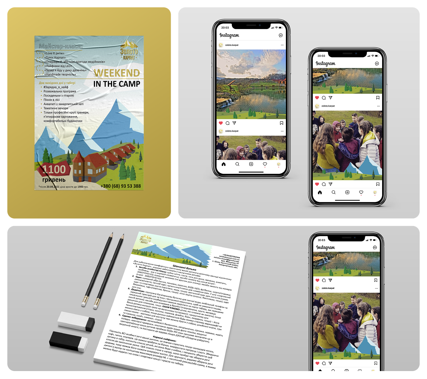
We worked on a series of materials for internal and external use, including:
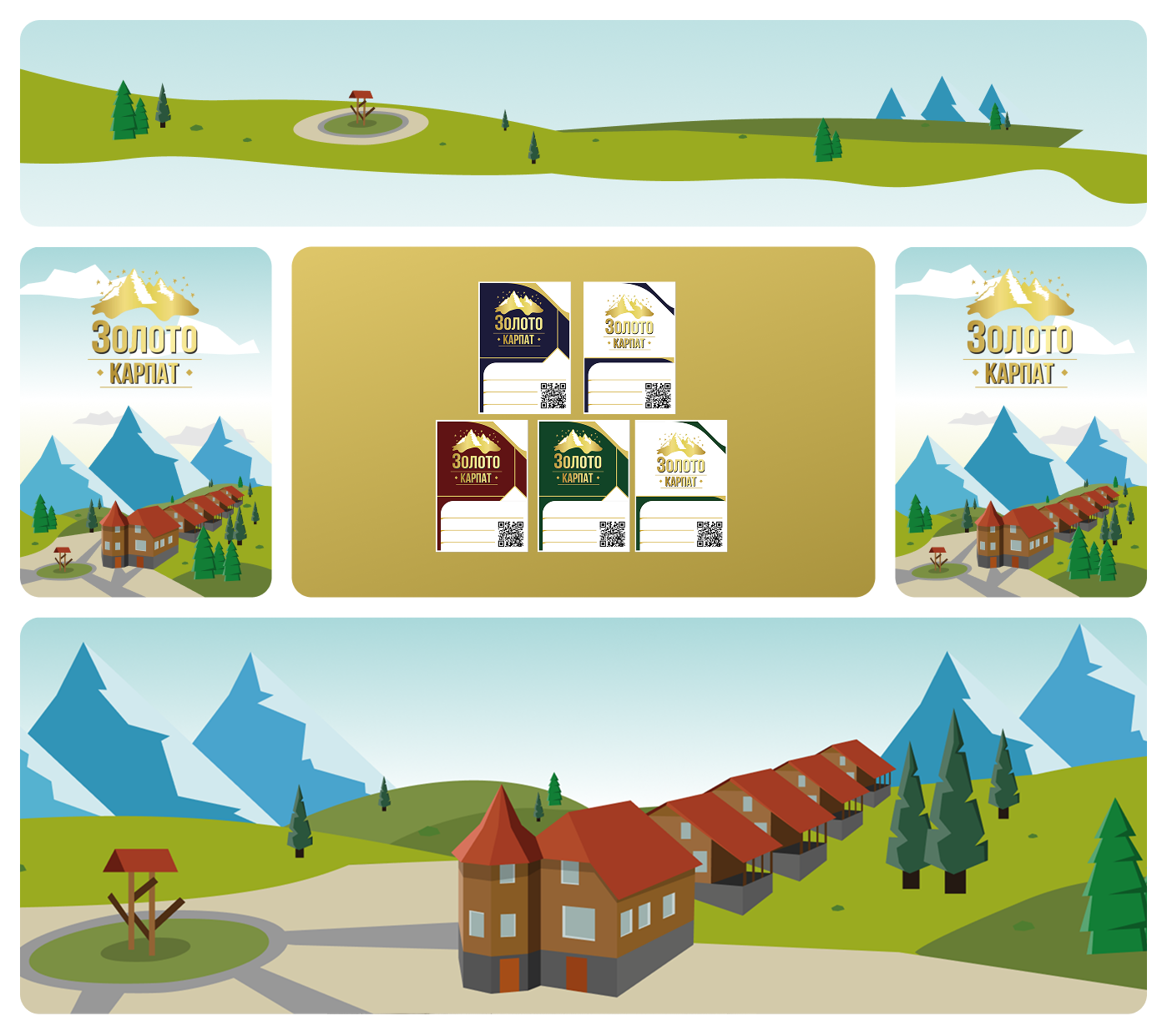
- badges;
- notebooks;
- posters;
- certificates;
- documents;
- social media posts.
It was important that all these materials looked cohesive and maintained the camp's atmosphere.
Visual Approach
The camp's location served as the foundation for the identity. We created vector illustrations of the site and its surroundings: the mountains, the nature, and the space where camp life unfolds.
This solution became the central element of the entire design and set the tone for all materials.
Summary
Sometimes you don't need to overthink it; you just need to look around. The camp received a recognizable and warm visual identity that blends organically with its natural surroundings.
Project team:
Oleksii Norka - Graphic Designer
Alina Pavliuk - Graphic Designer